
 REFERENCE LIBRARY


 Getting to know the Data Dictionaries

Now we know how to get Data Dictionaries to work in your application, it is time to configure them.
Video example
Let’s go back to the Data Dictionary modeler. The first tab page, Columns, is open. On the left you see all columns of the table, and on the right the settings for the selected column. Let me collapse the categories and go to the first category, Appearance.
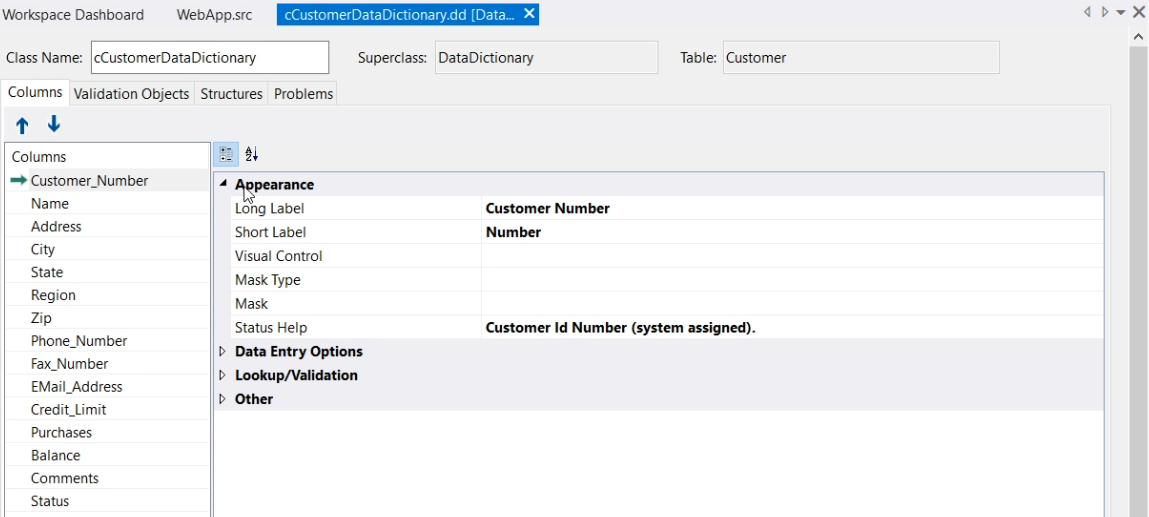
First, you can set a default label for an object or grid-column that refers to this column. When left empty, the name of the column will be used when creating a Data Entry Object for it. But note that it is only applied within the Studio by either a wizard or a drag and drop operation. Once the control is created, it is no longer used.
The value of “Long Label” is used for single value controls such as forms and text edit.
The “Short Label” value is used for multi value controls such as grids and prompt lists, where there is usually less space for a label in a column layout.
Instead of setting the labels here in the modeler, you could also press F7 to open the code editor and then type:
Set Field_Label_Long Field Customer.Name to "Customer Name"
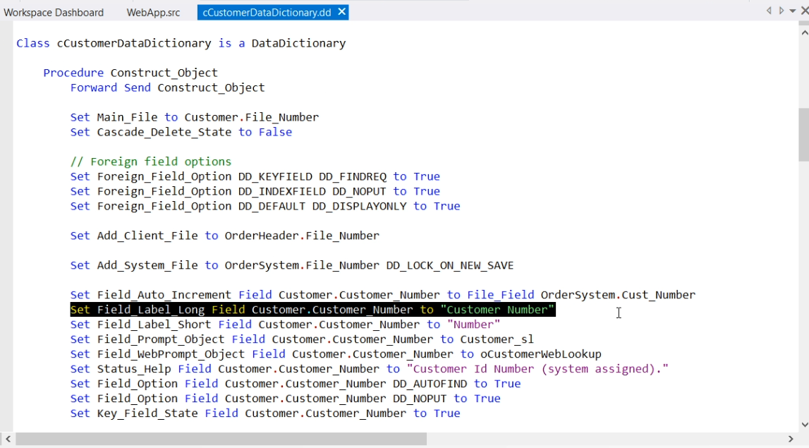
Note the FIELD keyword preceding the database column name.
Visual control
Next, Visual control. Here you can choose the class that is used when the Studio creates a control attached to this data source. Like the label setting, this setting is only of use when the control is created, either via a wizard or a drag and drop operation.
By default it is not set, and then the Studio takes a TextEdit for text fields and a Form for others. Depending on whether you are working on a Windows or a Web project, it will do the correct one. So, dbTextEdit in Windows and cWebEdit in Web for example.
It is also possible to type another class name, such as dbBitmap in this case, but note that the Studio must know how to render that class or else it will not paint the control at design time. But do take note of the fact that Windows and Web use different classes. For example, when choosing the Combo, the Studio will make it a dbComboForm in a Windows application and cWebCombo in a web application.
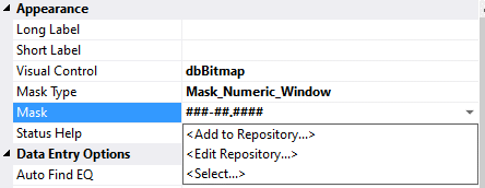
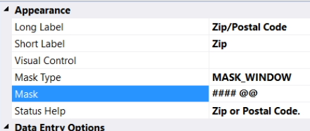
Masks
Then the Masks. A mask consists of a type and a string with mask characters. This powerful feature enables a data-entry template, or mask, for the values that can be entered. They constrain entries to only those characters, digits and special characters that the masks allow, and only in those specific positions within a column. The mask characters are not saved in the column values and are for improving the entry and appearance of the displayed data only.
Let me show an example.
Video example:
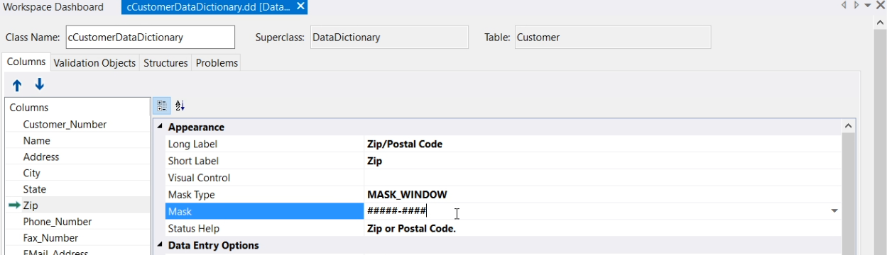
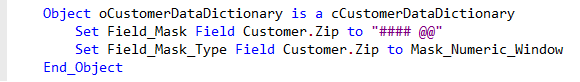
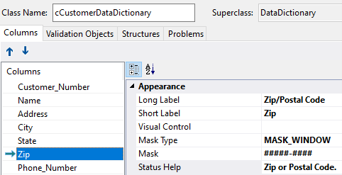
Here is the Customer Data Dictionary. Notice the mask for the Zip code, which is 5 numerical characters, followed by a dash and then 4 numerical characters.
Here is the running application. I click on a customer to edit the ZIP code. I clear it and try to enter letters. I can’t. I can type 5 digits and then it automatically puts a dash in it, and I can type the other 4 digits. But nothing else.
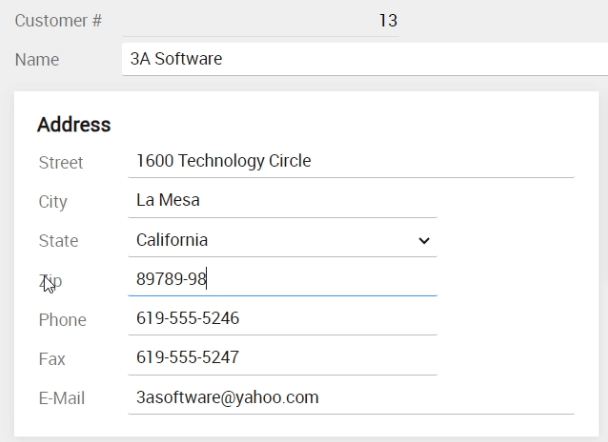
The great thing about this, is that other views that have the Zip code, also apply the same mask. You do not have to go over each view that has a customer Zip code to set the same mask.
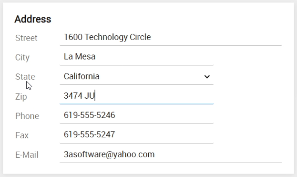
Now, what will happen if I change the mask in the Data Dictionary. Let me change it to the Dutch Zip code format, which is four digits, a space and two letters.
And compile and run the application. Now you can see that in both of the two views, the mask has changed to the Dutch format. Without any further programming.
There are two categories of masks. There are default masks and custom masks. Default masks can be used without defining a string of mask characters. This is often what you need. Here is a list of default mask types.
Default Mask Types:
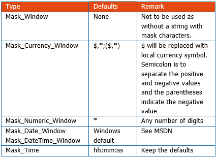
You can use default masks for currency, numeric, date and time columns. If, for example, you need a mask for a date field, just select Mask_Date_Window and you’re done. Do make sure that both the system and user locale are the same, because the mask will be constructed from the Windows regional settings configuration. Note that when you are running a Web application, the settings from the server are applied, and users in other countries may experience things not as they would expect.
Now, if you need a currency, numeric or time mask, and the default mask is not exactly what you want, you can specify your own mask string. These are custom masks.
Custom Masks:
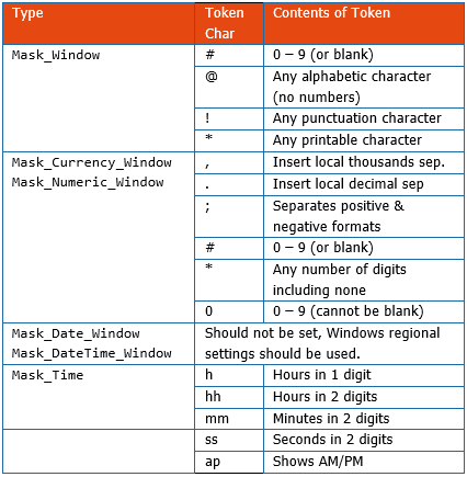
And if you need a completely different type of mask, for example for a zip code or phone number, you should use the Mask_Window type and also specify a custom mask. If you would use Mask_Window without defining a mask string, no mask is applied. In this table all mask characters are shown that you can use to construct the exact masks.
Pressing F7 shows the generated code, which could look like this:

So, the US Zip code mask is defined in the DD class. This mask will be applied in the application wherever a data entry object of this ZIP code is present and the DDO is used. So do not forget to actually use the Data Dictionary in your component by creating a DDO, as explained in lesson 2.
It is possible to override the mask setting from the class by writing the same setting in the DDO. In this example I changed it in the DDO to the Dutch zip code:
This means that only in this component it applies the Dutch mask. In the rest of the application it does the other one.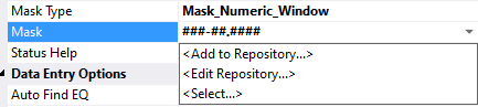
If you make use of masks very often, it can be handy to create your own masks repository. This is a set of masks that you have created, from which you can then easily select, to apply the same masks to more columns in your application.
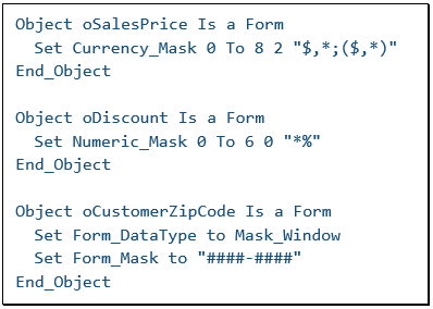
By the way, it is possible to use masks in your application for Data Entry Controls that are NOT connected to a DDO. See the examples next to me. This would avoid using the Data Dictionary. But generally it is preferred to use the Data Dictionaries.
Status Help
This almost concludes this lesson, as there is one more appearance setting in the Data Dictionary to mention, which is Status Help.
This value will be used to specify the status help that should be displayed to the user when a control linked to the column has the focus. It is a small piece of text that is displayed in the status bar of the MDI panel and should for example tell the user what kind of information can be entered.
OK, in the next lesson we’ll talk about more column settings, the Data Entry Options, which tell DataFlex what to do when the user enters data.
